Eleven industries without eleven CSS projects
A healthcare website, a hotel and a real estate agency rarely share the same visual identity. Industry-specific graphic conventions immediately communicate the nature of a business. Yet the consent interface often retains a generic appearance unrelated to the rest of the website.
I designed eleven industry themes for tarteaucitron.io Pro. They provide starting points for different professional environments without asking every agency or administrator to rebuild an entire CSS stylesheet.
The collection covers Campus, Construction, Hotel, Real Estate, Legal, Medical, Fashion, Optical, Pastry, Restaurant and Spa. Each theme adapts the colors, surfaces and visual details of the banner, settings panel and related components.
Hospitality and food: Hotel, Restaurant and Pastry
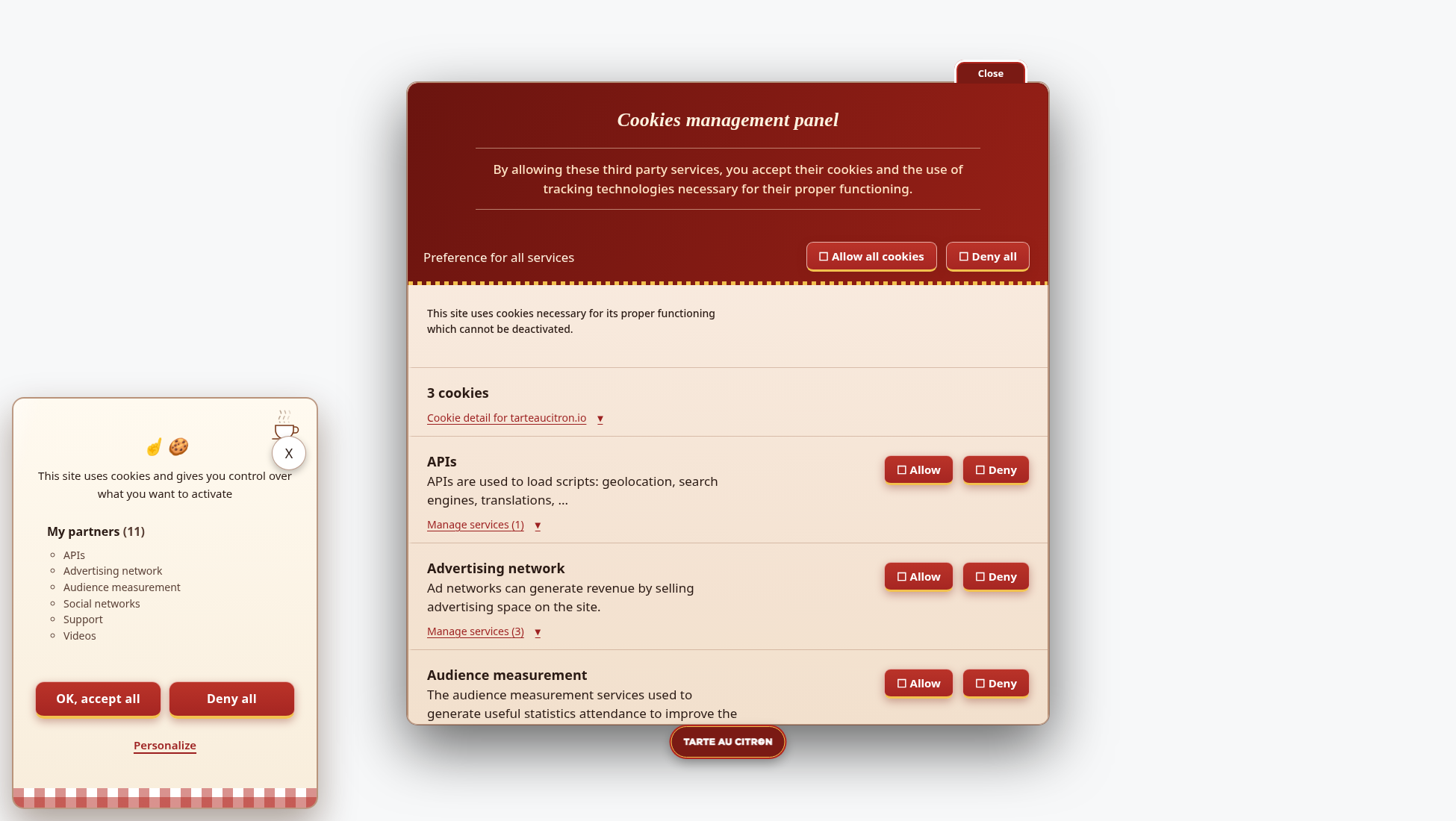
Hotel combines navy and cream to evoke traditional hospitality. Restaurant favors warm reds and a welcoming atmosphere. Pastry uses pink and brown, with a clear reference to confectionery and baking.
These industries are related, but their conventions are not interchangeable. A guesthouse, a brasserie and a bakery may present content very differently. The collection therefore offers three distinct directions rather than a single generic tourism theme.
On booking or ordering websites, the banner should not obstruct essential actions for longer than necessary. Mobile behavior and the opening of the settings panel deserve particular attention.
Medical, Legal and Real Estate: restrained presentations
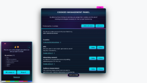
Medical uses turquoise and a clinical layout, without implying any special privacy guarantee. Legal combines navy blue and ivory for a more institutional interface. Real Estate uses teal and balanced surfaces.
For these professions, credibility depends on far more than a palette. A theme can complement an existing identity, but it must not suggest certification, stronger security or legal compliance that does not follow from its appearance.
Consent information must remain clear, especially when the website uses multiple third-party services. The settings panel retains its central role: explaining choices and allowing visitors to revise them.
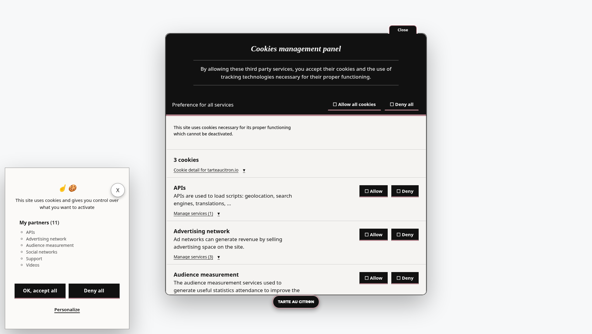
Fashion, Optical and Spa: three visual sensibilities
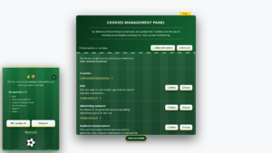
Fashion is deliberately reduced to black and white. Optical also uses strong contrasts, adding graphic red accents. Spa moves toward soft greens and a calmer atmosphere.
This variety makes it possible to choose a style without assuming an entire industry shares the same taste. A fashion store may prefer something expressive, while a wellness center may choose an almost neutral presentation.
In every case, the balance between accept and refuse actions should remain unchanged. Visual design must not be used to emphasize one choice at the expense of the other.
Campus and Construction: very different environments
Campus uses institutional blues and a structured organization. It may suit educational websites without claiming to satisfy public-sector accessibility requirements on its own.
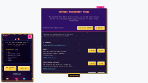
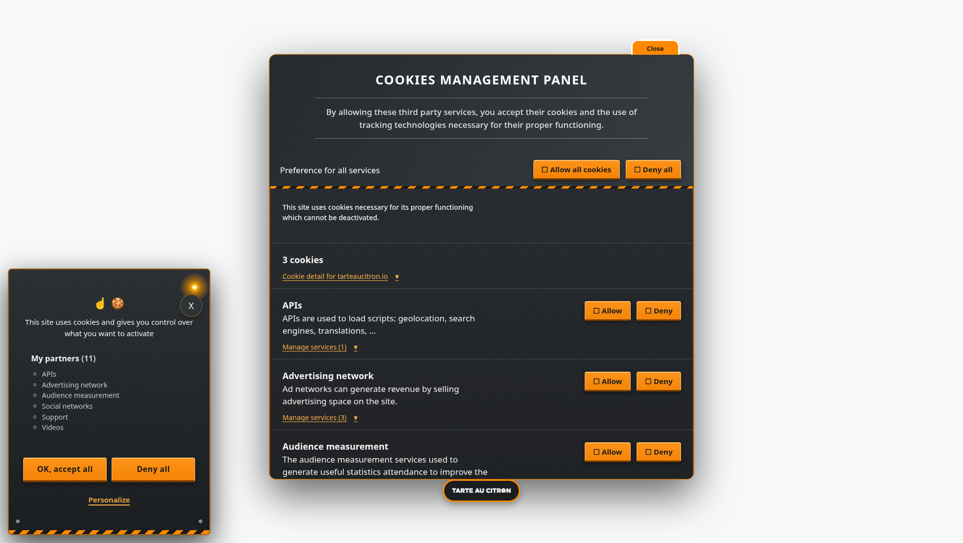
Construction features a dark interface and orange accents inspired by safety signage. Its visual vocabulary is more technical and assertive. Contrast and button states still need verification on the final website.
These two themes complete the collection with less obvious directions. They illustrate the overall idea: provide several graphic starting points instead of claiming that one banner design fits every industry.
What changes and what stays the same
Choosing a theme changes presentation. It does not change the configured list of services, the way tarteaucitron.js blocks third-party scripts or the preferences stored by the library. A new appearance must not become a new consent rule.
Accept and refuse actions should remain comparable in prominence. Controls in the settings panel must stay identifiable, even with very different colors and decorations. This consistency is particularly important when visitors want to revisit their decision.
Themes also affect service details, cookie information and the permanent icon. A screenshot of the banner alone does not show everything: customization needs to remain coherent when the full settings panel is opened.
Checks still needed on the final website
A theme does not remove the need to test the integration. Global website CSS can alter button sizes, fonts or colors. Fixed elements can cover part of the banner. Translations can also change the length of labels.
I therefore recommend checking mobile layouts, keyboard navigation, visible focus and different control states. Reduced-motion preferences also need attention when a theme uses animated effects.
Visual consistency should not be confused with RGAA or WCAG compliance. The final result depends on the whole interface and the environment in which it is used.
A Pro option without removing open source customization
These themes are intended for tarteaucitron.io Pro. Selecting them from the dashboard is designed to avoid manually editing CSS files whenever the appearance changes.
The open source version of tarteaucitron.js remains customizable through CSS. The new collection does not replace that capability or change how the free library operates.
To compare designs, the interactive gallery of 52 themes applies each style to a working consent interface and lets visitors open the settings panel. That is more informative than an isolated screenshot.
How agencies can evaluate an industry theme
For agencies, the practical benefit is not merely having a larger selection of colors. It is being able to start from a coherent set of styles covering the banner, settings panel and service controls. That can reduce repetitive CSS work when different clients need different visual presentations.
The theme should still be checked against the client’s existing typography, fixed navigation, mobile breakpoints and global stylesheet. A highly specific brand system may need further adjustments, and a generic industry theme should not be treated as a substitute for the client’s identity.
There is also an important distinction between a professional appearance and a legal guarantee. A healthcare-inspired interface does not automatically offer stronger data protection, just as an institutional palette does not establish accessibility compliance. Those qualities depend on actual implementation and verification. The theme provides a visual starting point; it does not change the obligations associated with consent.