Twelve themes that refuse to blend in
A consent banner is not required to be gray, white or blue. Its first job is to provide necessary information and let people make a free choice. That does not prevent a distinctive visual identity, even on websites with a particularly expressive design.
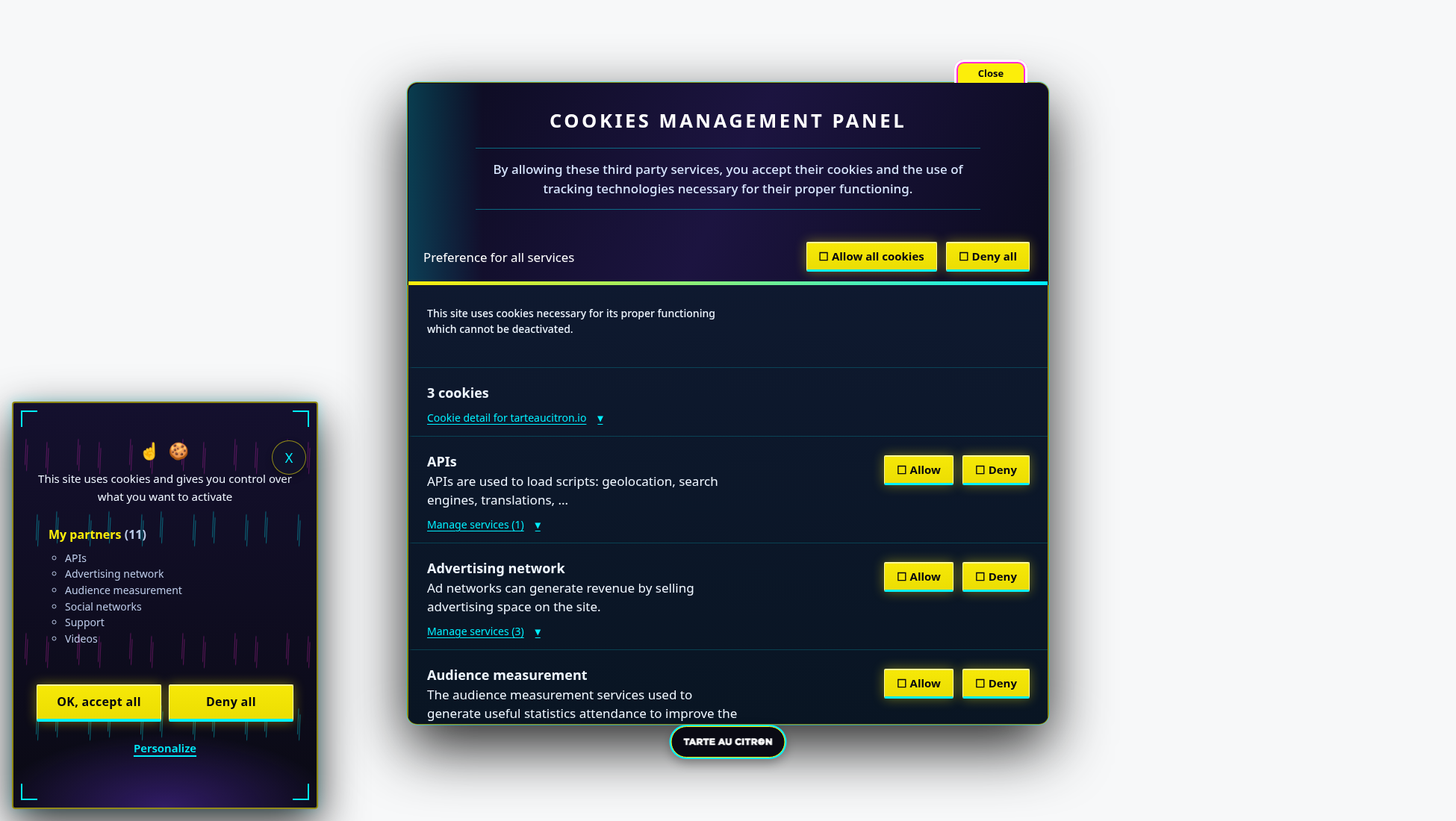
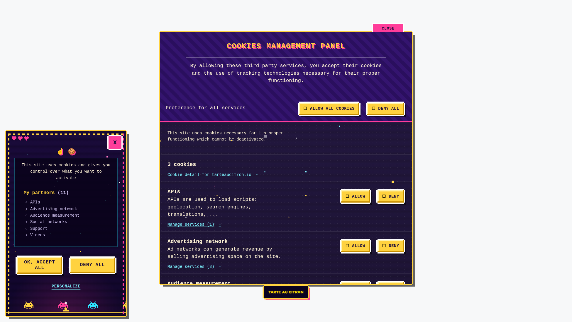
I created twelve deliberately creative themes for tarteaucitron.io Pro: Arcade, Candy, Citron, Comic, Cosmic, Cosmos Light, Cyberpunk, Glitch, Miami, Origami, Spatial and Vegas. Some reference video games, others science fiction, comic books or geometric shapes.
This family gave me room to explore less conventional directions. The challenge was to preserve understandable buttons and readable content while giving the entire interface a genuine personality.
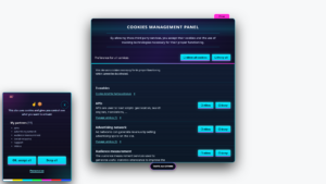
Glitch: my personal favorite
Glitch is the theme I enjoy most in this collection. It uses visual offsets, interference effects and cyan and magenta accents, as though the digital interface were briefly out of sync. It is certainly not the most discreet choice.
That is exactly the point: a banner can have a strong personality without changing what its controls do. Visitors must still understand the message, accept, refuse or open settings without hesitation.
Visual effects should not inconvenience people sensitive to motion. Reduced-motion preferences matter, and the actual result needs testing rather than relying on a static screenshot.
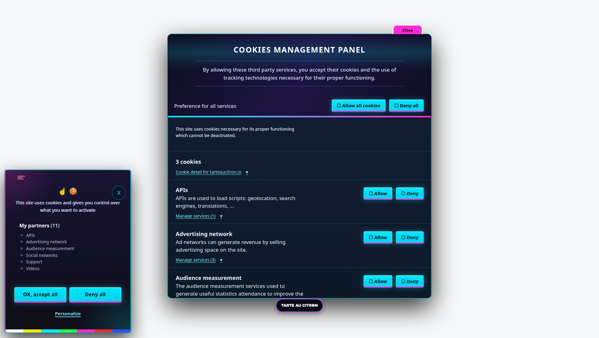
Cyberpunk, Cosmic, Cosmos Light and Spatial
Cyberpunk uses neon and an urban science-fiction atmosphere. Cosmic explores a dark palette with cyan and purple accents. Cosmos Light revisits the space-inspired concept in a brighter interpretation.
Spatial focuses more on navigation interfaces and technical details. All four share futuristic references, but they do not attempt to reproduce the same aesthetic.
The challenge is preserving readable service descriptions in visually rich environments. A settings panel may contain far more text than a banner and must remain practical to navigate.
Arcade, Comic and Vegas: popular references
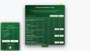
Arcade draws on video game cabinets and their visual conventions. Comic uses bold outlines and comic-book references. Vegas explores illuminated signs and intense colors.
These references are immediately recognizable, making the themes expressive. They may suit entertainment websites or strong brand identities, but they can also be chosen simply because someone likes their originality.
Decorative details must not overpower the controls. Consistent buttons and visible focus remain priorities even in a deliberately exuberant interface.
Miami, Candy, Citron and Origami: color and geometry
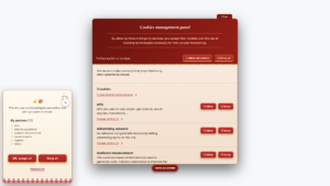
Miami uses pink and purple gradients inspired by a sunny retro aesthetic. Candy favors bright, playful colors. Citron is an obvious nod to the tarteaucitron name, with yellow tones and citrus references.
Origami follows a different direction based on geometric shapes and folded paper. It shows that originality does not require vivid colors alone: visual structure can create a distinctive identity.
These four themes complete a deliberately eclectic family. I did not try to make them interchangeable, but to explore different ways of moving beyond the standard banner.
What changes and what stays the same
Choosing a theme changes presentation. It does not change the configured list of services, the way tarteaucitron.js blocks third-party scripts or the preferences stored by the library. A new appearance must not become a new consent rule.
Accept and refuse actions should remain comparable in prominence. Controls in the settings panel must stay identifiable, even with very different colors and decorations. This consistency is particularly important when visitors want to revisit their decision.
Themes also affect service details, cookie information and the permanent icon. A screenshot of the banner alone does not show everything: customization needs to remain coherent when the full settings panel is opened.
Checks still needed on the final website
A theme does not remove the need to test the integration. Global website CSS can alter button sizes, fonts or colors. Fixed elements can cover part of the banner. Translations can also change the length of labels.
I therefore recommend checking mobile layouts, keyboard navigation, visible focus and different control states. Reduced-motion preferences also need attention when a theme uses animated effects.
Visual consistency should not be confused with RGAA or WCAG compliance. The final result depends on the whole interface and the environment in which it is used.
A Pro option without removing open source customization
These themes are intended for tarteaucitron.io Pro. Selecting them from the dashboard is designed to avoid manually editing CSS files whenever the appearance changes.
The open source version of tarteaucitron.js remains customizable through CSS. The new collection does not replace that capability or change how the free library operates.
To compare designs, the interactive gallery of 52 themes applies each style to a working consent interface and lets visitors open the settings panel. That is more informative than an isolated screenshot.
Why experimental themes still need restraint
Creative themes make the most sense when they are judged on the complete interface, not only on a striking banner screenshot. Service descriptions may be long, individual controls may have different states, and the settings panel must remain navigable. An effect that works as decoration can become distracting when repeated across every component.
I also pay attention to the difference between visual emphasis and influencing consent. The accept and refuse options must remain comparable, even when the surrounding design uses neon colors, bold outlines or playful shapes. A distinctive theme is not a reason to make one choice easier to notice than another.
Finally, motion should remain optional for people who request reduced animation. Website-level CSS may also change the result. That is why the interactive gallery is more useful than a set of static images: it provides a way to inspect how the different parts of the consent interface look together.