Why consent readability deserves attention
A consent interface is often the first interaction visitors encounter when opening a website. It must explain the role of third-party services and present available choices without creating unnecessary reading effort. Its position is unusual: it temporarily interrupts navigation while remaining understandable and usable for as many people as possible.
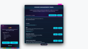
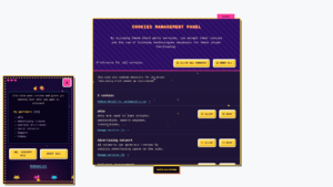
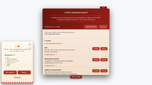
I added three themes to tarteaucitron.io Pro to approach this problem from different angles. A11y Comfort favors space, A11y Compact offers a denser presentation, and A11y Contrast relies on strongly differentiated colors. None changes the consent mechanism itself: the changes concern presentation.
The name of this family is not an accessibility certification. It describes a design intention. Actual accessibility depends on code, content, settings and the final website integration. This distinction matters especially for organizations working under formal accessibility requirements.
A11y Comfort: room to read
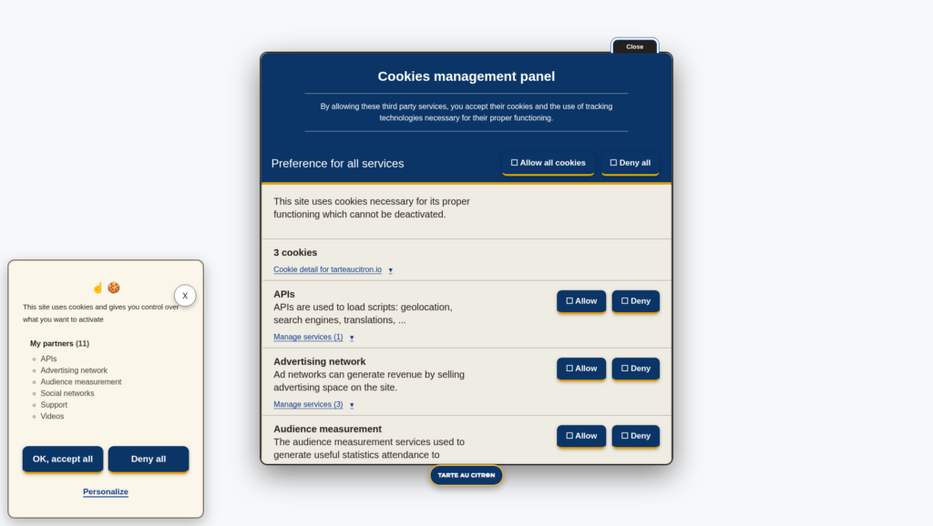
A11y Comfort gives text, actions and interface sections more breathing room. White space is not merely decorative: it separates information and makes the hierarchy between the main message, buttons and detailed settings easier to follow.
A consent banner packed with small elements can be tiring to read. This layout makes the different areas more distinct, helping visitors identify where an explanation begins and where an action is available.
A spacious layout also occupies more screen area. On narrow displays, responsive behavior becomes essential. Buttons must remain usable and paragraphs should not be squeezed or overflow their containers.
A11y Compact: less space without hiding information
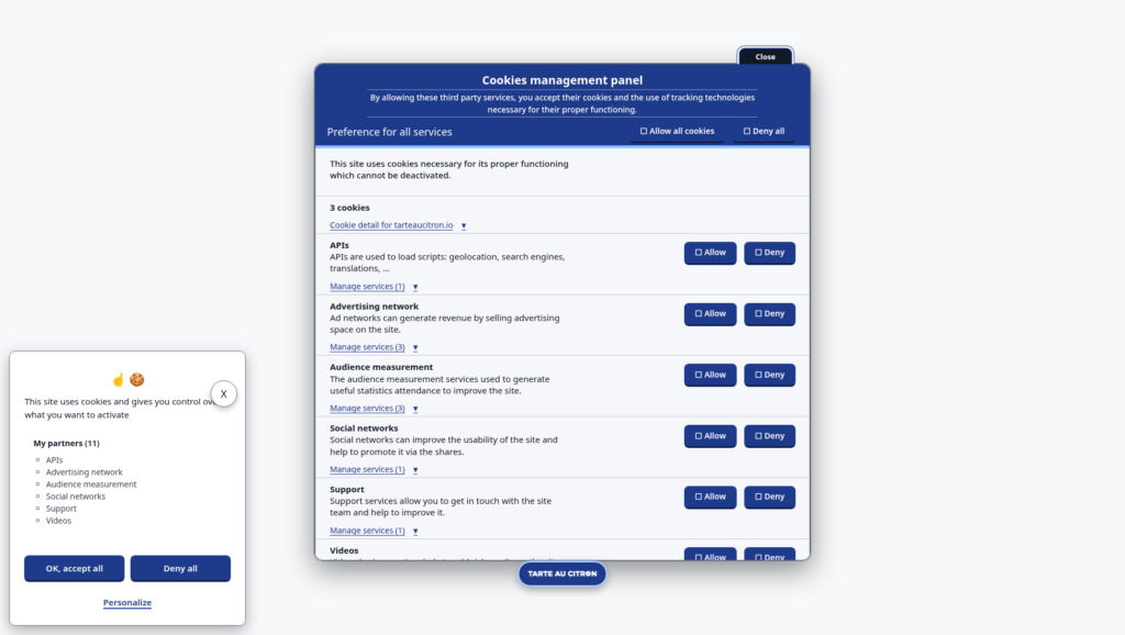
A11y Compact starts from a different constraint. Some websites prefer a banner that occupies less space, particularly on desktop. The aim is not to remove explanations but to adjust margins, alignment and structure to create a tighter presentation.
Compact layouts can work well when the hierarchy remains clear. They become problematic when clickable targets are too small or lines of text are cramped. There is a difference between thoughtful compactness and making everything as small as possible.
The challenge increases in the settings panel, where multiple services may have individual descriptions and controls. The layout must remain understandable even with long lists or translations that require more words.
A11y Contrast: stronger visual separation
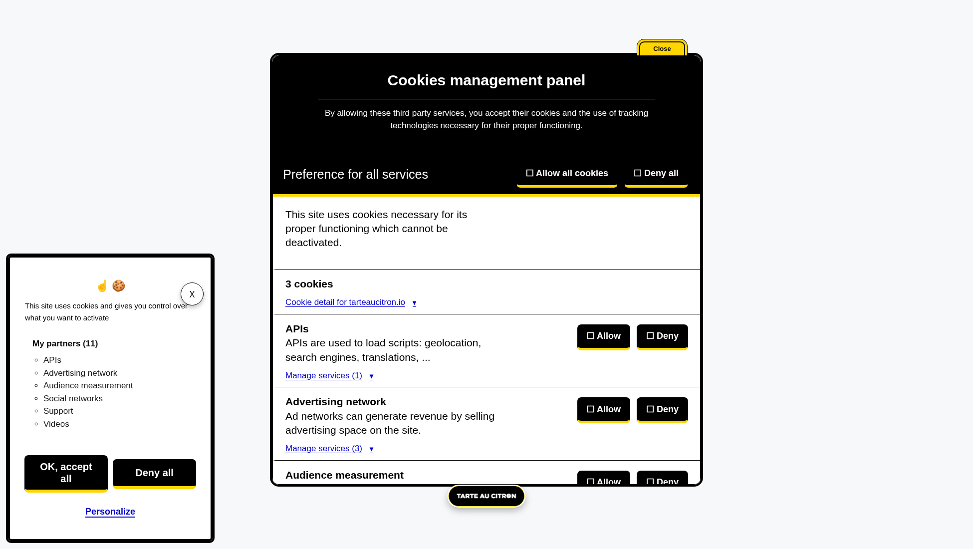
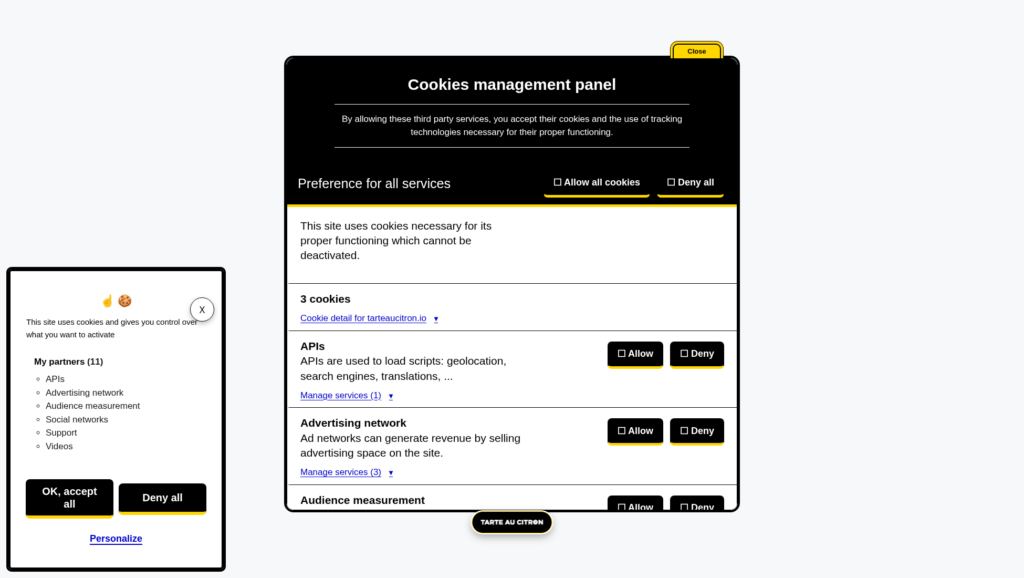
A11y Contrast primarily uses black, white and yellow. The intention is to make content areas and controls more distinct. Bright colors may help users notice an element, but color must never be the only way to communicate its purpose.
Text and component contrast can be measured. However, a screenshot that merely looks high-contrast is not proof of compliance. Actual colors, font sizes, hover and focus states, and disabled elements all need to be checked in the browser.
The theme therefore represents a design direction, not an audit result. Additional website CSS can change backgrounds, borders or text colors and undermine combinations that originally worked.
Accept and refuse must remain equally visible
Readability is not only about paragraphs. Accept All and Refuse All should be easy to find and comparable in prominence. A theme should not make refusal less visible or move it into a secondary area for aesthetic reasons.
These presentations aim to preserve coherent controls. The selected state of an individual service should also remain identifiable without relying exclusively on a color difference that some people may struggle to perceive.
Keyboard navigation matters as well. A visible focus indicator helps users follow their position, while tab order and accessible names depend on the interface behavior, not simply its visual appearance.
Accessibility is more than a color palette
An accessible interface needs testing in its actual context. Contrast is part of the work, but so are heading structure, accessible names, screen reader output, status messages and behavior when users increase zoom.
Integration may introduce problems too: overly broad global CSS, fixed elements covering buttons or custom fonts changing dimensions. Pro themes cannot anticipate every detail of every website where they will be used.
I therefore describe A11y Comfort, Compact and Contrast as three readability-focused options, rather than three ready-made compliance guarantees. Final verification is still required, even when the visual starting point has been carefully considered.
Compare the three themes on a working interface
Screenshots help explain broad differences, but they cannot show keyboard navigation or the settings panel in action. The most useful comparison is to apply the themes to a real, working interface.
The interactive gallery of 52 themes lets visitors switch between A11y Comfort, Compact and Contrast, then return to Default. The settings panel can be opened to inspect how different components appear.
These three themes belong to the tarteaucitron.io Pro collection. The open source library retains its existing CSS customization options; themes are an additional convenience for Pro users.
Practical checks before using a readability theme
A useful first test is to open the settings panel rather than looking only at the initial banner. Read the longest service descriptions, switch between choices and inspect whether selected states remain clear. The interface should also be checked at narrow widths and with enlarged text. A design that looks spacious on a large monitor may behave differently on a phone.
Keyboard testing provides information that screenshots cannot capture. Move through the available controls, check the focus indicator and verify that no part of the interface becomes inaccessible. A screen reader check can reveal issues that have nothing to do with colors or spacing, including unclear control names or unexpected reading order.
These checks are not a substitute for a complete accessibility audit. They are a practical way to identify obvious integration problems before publishing a new appearance. I consider the themes a visual foundation that still needs to be validated on the actual website.