CMP providers regularly discuss consent rates and acceptance optimization.
The logic sounds obvious: the higher the rate, the better the banner must be.
I find that conclusion far too simplistic.
A CMP’s purpose is not to convince visitors to accept. It should allow them to understand the proposed choice and express it easily.
A rejection is not a failed conversion
On an ecommerce website, an abandoned cart generally represents a commercial objective that was not achieved.
This reasoning cannot be directly transferred to consent.
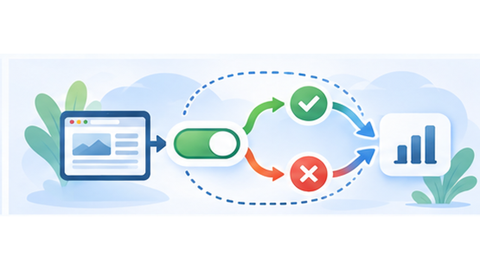
When a visitor deliberately clicks “Reject all”, the CMP has actually performed its role: it collected a choice.
Treating that rejection as a failure naturally encourages interface designs intended to discourage it.
Design can dramatically change the rate
A highly visible acceptance button attracts more attention.
A rejection option hidden in a gray link or behind an additional step will mechanically be used less often.
It is therefore possible to artificially improve acceptance rate without improving consent quality.
This is precisely why consent interfaces should not be optimized like commercial landing pages.
Accepting and rejecting should remain equally easy
French privacy guidance requires rejecting trackers to be as easy as accepting them when consent is required.
This principle deliberately limits some conventional conversion optimization techniques.
Adding a step to rejection, significantly reducing its contrast or using ambiguous wording may produce more acceptance, but this is not a good way to improve a CMP.
Choice symmetry is part of the expected behaviour.
A good rate also depends on the website
There is no universal rate that determines whether a banner is good or bad.
The audience, website type, requested services and relationship with users completely change the context.
A website where visitors understand why an external feature is useful may produce different choices from one filled with advertising trackers.
Comparing two percentages without knowing these factors therefore provides little information.
Measurement methodology changes the result
The term “acceptance rate” itself can describe several calculations.
Is it calculated per visitor, session, banner display or only among people who clicked?
What happens to visitors who leave without making a choice?
How are people who later change their mind counted?
Two providers can display different rates simply because they are not measuring exactly the same thing.
A rate change should mainly trigger a question
I find it more useful to compare a website with itself over time.
If its acceptance rate suddenly moves from 50% to 70% after a change, the reason should be understood.
Is the new wording clearer? Was a service removed? Did the audience change? Did rejection become less visible?
The statistic then becomes a signal for analysing the interface.
Understanding can genuinely improve consent
Rejecting dark patterns does not mean a banner should deliberately be bad.
Simple wording, clear presentation and understandable explanations of purposes can help visitors make a decision.
A fast, accessible interface that works properly on small screens also improves the experience.
These improvements are desirable even if they do not increase acceptance rate.
Avoid consent fatigue
An unnecessarily complex banner can also encourage visitors to click the first button simply to make it disappear.
Obtaining a “yes” this way is not particularly meaningful.
I prefer a concise first level followed by a detailed panel for people who want to manage choices service by service.
Simplicity can improve interaction quality without trying to influence its conclusion.
Customization needs limits
tarteaucitron allows extensive visual customization through available options and CSS.
This freedom allows the CMP to integrate properly with the website design.
It should not be used to turn acceptance into a huge colorful button and rejection into an almost invisible option.
I discuss this in my article about consent banner customization.
Accessibility also improves choice quality
Someone using a keyboard needs to reach the different actions equally easily.
Buttons need to remain understandable with screen readers and contrast needs to remain sufficient.
These are not consent-rate optimization techniques. They are simply properties of a correctly designed interface.
The main checks are explained in my guide to accessible cookie banners.
What should actually be optimized?
Rather than the number of acceptances, I would optimize the quality of the interaction.
- Does the visitor understand what is being asked?
- Are acceptance and rejection immediately available?
- Is the detailed panel easy to use?
- Does the interface work with a keyboard and on mobile?
- Is the choice technically applied correctly?
- Can the visitor change the choice later?
These questions seem much more useful than an arbitrary target of 70% or 80% acceptance.
Measure without turning the CMP into a marketing tool
Statistics remain useful for understanding what happens.
Acceptance rate, rejection and preference panel openings can reveal interesting changes.
I discuss these indicators in my article about consent statistics.
But measuring behaviour does not mean it needs to be pushed in a particular direction.
The best rate is not necessarily the highest
A consent rate should be interpreted as the result of choices made in a particular context.
If it is high because visitors genuinely want to accept, that is perfectly fine.
If it is high because the interface makes rejection difficult, the number loses much of its value.
I prefer a CMP with 50% acceptance obtained through clear choices over one claiming 90% through an interface designed to discourage rejection.