
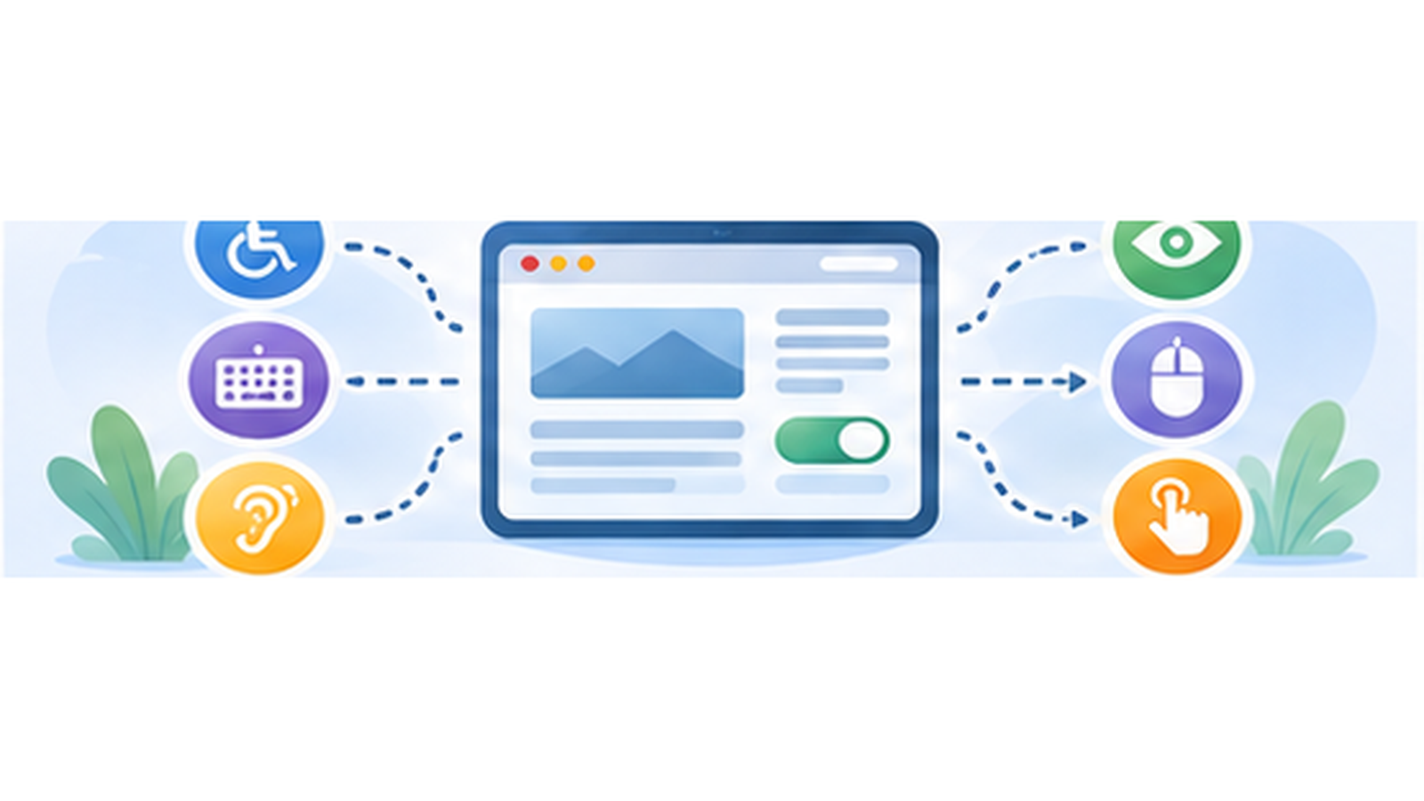
A cookie banner is often the first interactive interface encountered when arriving on a website. If it is inaccessible, the problem therefore appears before the visitor can even properly use the content.
The issue is not limited to adding a few ARIA attributes. An accessible banner must be understandable and usable with a keyboard, maintain visible focus, provide sufficient contrast and remain coherent with screen readers.
These properties also need to survive customization. A CMP may provide an accessible interface by default and become much less usable after a few lines of CSS.
A cookie banner is a real interface
A consent banner generally contains several interactive components: accept and reject buttons, preference access, categories, individual services and a mechanism for closing or reopening the panel.
It therefore needs to be treated like any other website interface.
A visitor who cannot use a mouse must be able to reach the different actions. Someone using a screen reader needs to understand their purpose. A visually impaired user needs to distinguish text and interactive components.
The fact that the interface may only be displayed for a few seconds does not reduce these requirements. Its blocking or highly visible nature can actually make poor accessibility particularly disruptive.
Everything should start with the keyboard
The simplest test is to put the mouse aside and use only the Tab key.
Interactive elements should be reachable in a logical order. Shift+Tab should move backwards. Buttons should be activatable from the keyboard.
It should never be necessary to click with a mouse to reject cookies, open preferences or validate a selection.
This test is extremely simple and already detects many accessibility problems.
Focus must remain visible
Being able to reach a button with the keyboard is not enough if there is no way to know which element is currently selected.
Focus must remain visually identifiable. Globally removing CSS outline without providing an alternative is therefore a very bad idea.
Focus contrast and visibility are particularly important in an interface containing several buttons close to each other.
WCAG also gives particular attention to focus, including its visibility and ensuring that an element receiving focus is not hidden by other content.
Pay attention to focus when opening the panel
Detailed preference panels introduce another difficulty.
When an interface behaving like a dialog opens, focus behaviour needs to remain coherent. Users should not continue tabbing through invisible elements behind the panel without understanding what is happening.
When it closes, navigation should also remain predictable rather than arbitrarily returning the user to the beginning of the page.
These details may seem secondary with a mouse. With a keyboard or assistive technology, they completely change how the interface is used.
Buttons need understandable names
A screen reader does not necessarily benefit from all the visual information used to understand an interface.
Buttons and controls therefore need accessible names that match their purpose.
An icon alone may be visually obvious and completely ambiguous when announced without context. This is particularly true for the control used to reopen consent preferences.
Native HTML elements remain an excellent foundation. A real <button> already provides keyboard behaviour and semantics that should not be unnecessarily rebuilt with a <div>.
Contrast applies to text and the interface
A very subtle banner may look attractive while being difficult to read.
Text needs sufficient contrast against its background. Components required to understand the interface must also remain perceptible.
Problems often appear after customization: light gray text, an almost invisible secondary button, removed borders or a focus color too close to the background.
A visual identity should not make rejection or preference management difficult to perceive.
Accessibility and consent sometimes overlap
An accessible consent interface needs to make the different choices understandable and usable. An honest consent interface also needs to avoid artificially pushing users towards one of those choices.
The two subjects are not identical, but they frequently overlap.
A huge high-contrast “Accept all” button accompanied by an almost invisible gray rejection option is both a poor interface decision and a problem for the quality of the choice being offered.
Privacy authorities require rejecting trackers to be as easy as accepting them. Accessibility should therefore not become an excuse for making an action technically available but practically difficult to find.
Customization can break an accessible interface
tarteaucitron allows extensive banner customization. Colors and various options are available from the Pro console, custom CSS can be added and the interface remains standard HTML, CSS and JavaScript.
This freedom also creates responsibility.
A CSS rule can remove focus. A custom color can make text unreadable. A repositioned element can hide a button on mobile. A JavaScript modification can disrupt navigation order.
Accessibility therefore needs to be retested after significant customization rather than assuming that the properties of the original interface are automatically preserved.
Zoom and small screens are easy to forget
A banner also needs to remain usable when available space decreases.
On mobile or at high zoom levels, buttons may wrap across several lines and the content may become taller than the screen.
All actions need to remain reachable, content needs to scroll correctly and no important button should end up outside the accessible area.
An interface that works perfectly on a 27-inch desktop display may become highly problematic on a phone or at high zoom.
Testing with a screen reader provides another perspective
Keyboard testing is an excellent first step, but it cannot detect every problem.
Using VoiceOver on macOS or iOS, NVDA on Windows or another screen reader makes it possible to hear how components are actually announced.
Headings, groups of choices, button states and controls need to remain understandable without seeing their position on the page.
You do not need to be a daily screen-reader expert to discover obvious mistakes. A few minutes can often reveal an unnamed button or an incomprehensible structure.
A simple checklist for testing a CMP
- Open the website without using the mouse.
- Navigate through every action using Tab and Shift+Tab.
- Check that focus always remains visible.
- Accept, reject and customize services using only the keyboard.
- Check behaviour when opening and closing the detailed panel.
- Test at high zoom and on a small screen.
- Check contrast after any visual customization.
- Perform at least one test with a screen reader.
This does not replace a complete accessibility audit, but it already eliminates many practical problems.
Accessibility should not be an optional CMP feature
I consider accessibility a normal property of a consent interface, not a premium feature to enable.
tarteaucitron regularly evolves in this area, notably thanks to feedback and contributions from specialized developers using the open-source project.
This is also one of the advantages I see in developing the project publicly: an improvement made for an accessibility requirement can benefit every user.
A CMP exists to ask for a choice. The minimum requirement is therefore that everyone can actually make that choice.